Map-based applications are among the most-used programs on smartphones and mobile devices. Millions of people now use online maps, and this huge user base is ready to apply maps in imaginative ways using Web GIS.
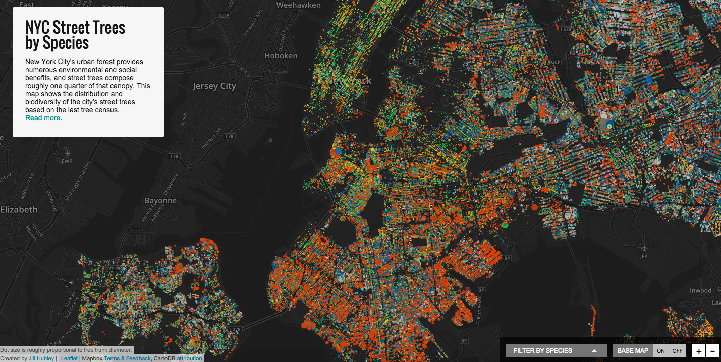
Mapping can generate a rich understanding of the connections between people, places and organizations over space and/or time. Jill Hubley’s interactive map of the New York Urban Forest is an outstanding exemplar of beautiful and effective data visualization.
ESRI Arc-GIS has built a large global community of mappers using maps to support their research.
In the past decade participatory mapping has been examined by a range of organizations as a powerful tool for community engagement in problem-solving. NOAA (US National Oceanic Atmospheric Research Agency) has studied the use of participatory mapping for coastal regions. The term is used broadly to characterize a process where the problem-solvers participate in mapping a problem solution.
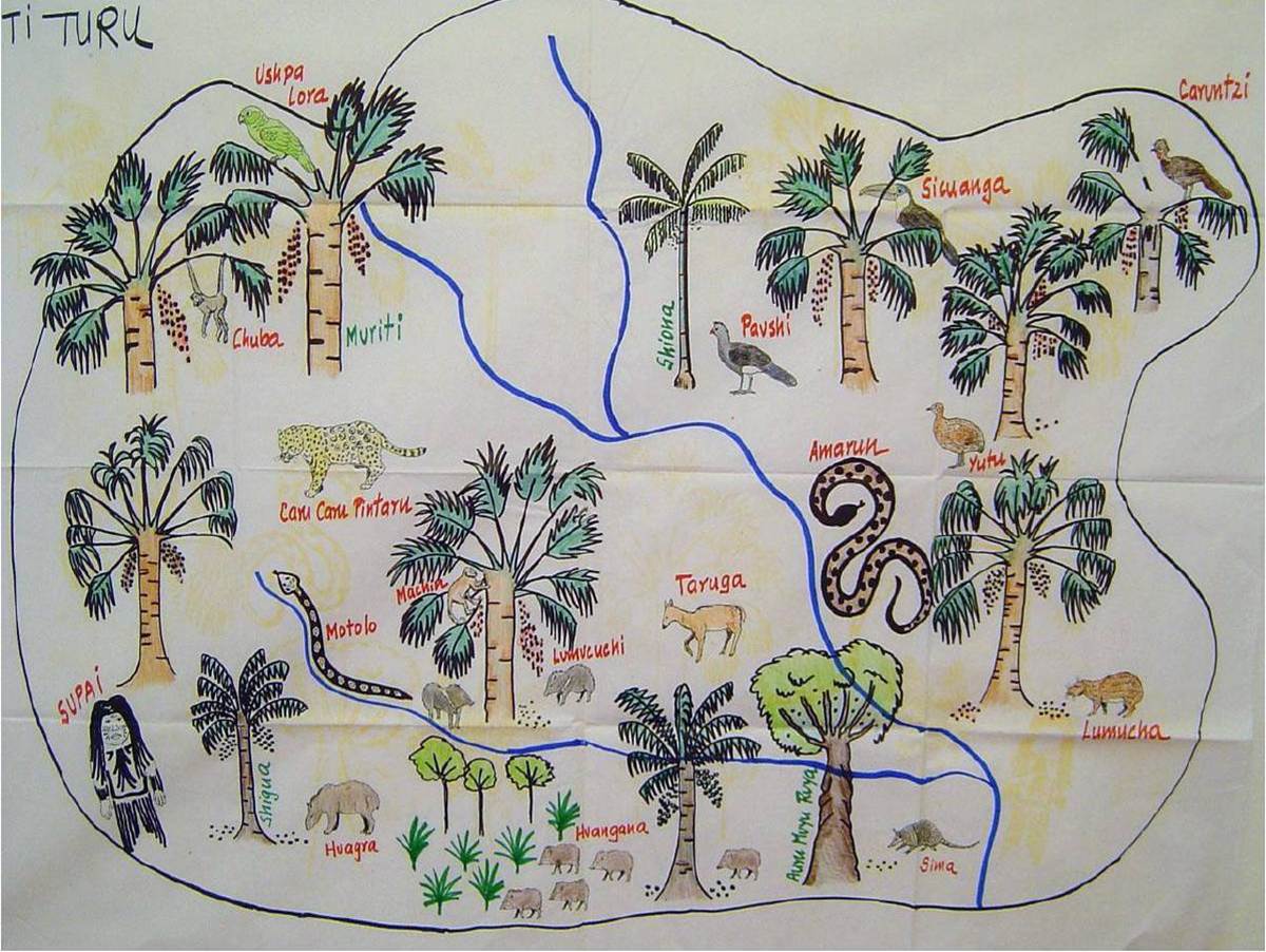
There is growing interest in visualization to stimulate community participation and maps vary widely in style and content, from satellite base maps, such as those shown above, to story-telling maps, such as this example of Participatory Ecosystem Mapping in Kichwa communities of Ecuador under the guidance of Alfredo Vitery, Ecuador, and Wendy Pineda, Perú.
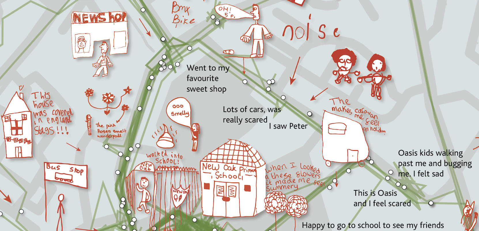
Maps are a tool that can be technically annotated and linked to a back end database, or can engage storytellers, not only among indigenous tribes but including school children, such the Collective Sensory Experience Map, New Oak Walking Map assembled by map artist Christian Nold, who works with the local community to creat his maps.
The greatest challenge is to develop a hybrid between the two extremes of “indigenous people tell their stories via maps” and the high-tech for experts-only maps, i.e. maps that tell stories backed up by accurate data that can be filtered and clustered to address different questions. The Climate Data Explorer of the World Resources Institute is a powerful exemplar of that job well done.
Assen Assenov holds a Masters in Urban Design from Harvard GSD and B. Arch. from the University of Rome. His design skills in urban design and architecture are complemented by his technical skills in systems management and GIS, e.g. for Apple Inc. HQ in Cupertino and ESRI ArcView for the Macintosh.
The map below, by Moody Studio team members Assen Assenov and Massimiliano Roda, shows how the Boston Metropolitan Region is composed of many interlocked puzzle pieces. The map may be seen as a basic gameboard, to be developed to address specific regional challenges of this Metropolitan Region through participatory mapping, defined by the UK National Centre for Public Engagement as a “group-based qualitative research method” that gives participants freedom to shape discussion on a given topic with minimal intervention from researchers.

The map above can be seen as the game board at the start of an earthDECKS problem-solving “game,” the canvas on which stakeholders engage to address the challenges of their town. For example, imagine using the map as a tool to work on early warning systems to engage the community to address alternative projections for sea level rise in Boston. Boston was named one of the Rockefeller Foundation Resilient Cities. 2o15 was a year for raising awareness of the potential devastating impacts of sea level rise and proposing alternative solutions to address this problem. The map below overlays a worst case scenario for flooding in Boston if sea level rise is 7.5 feet.
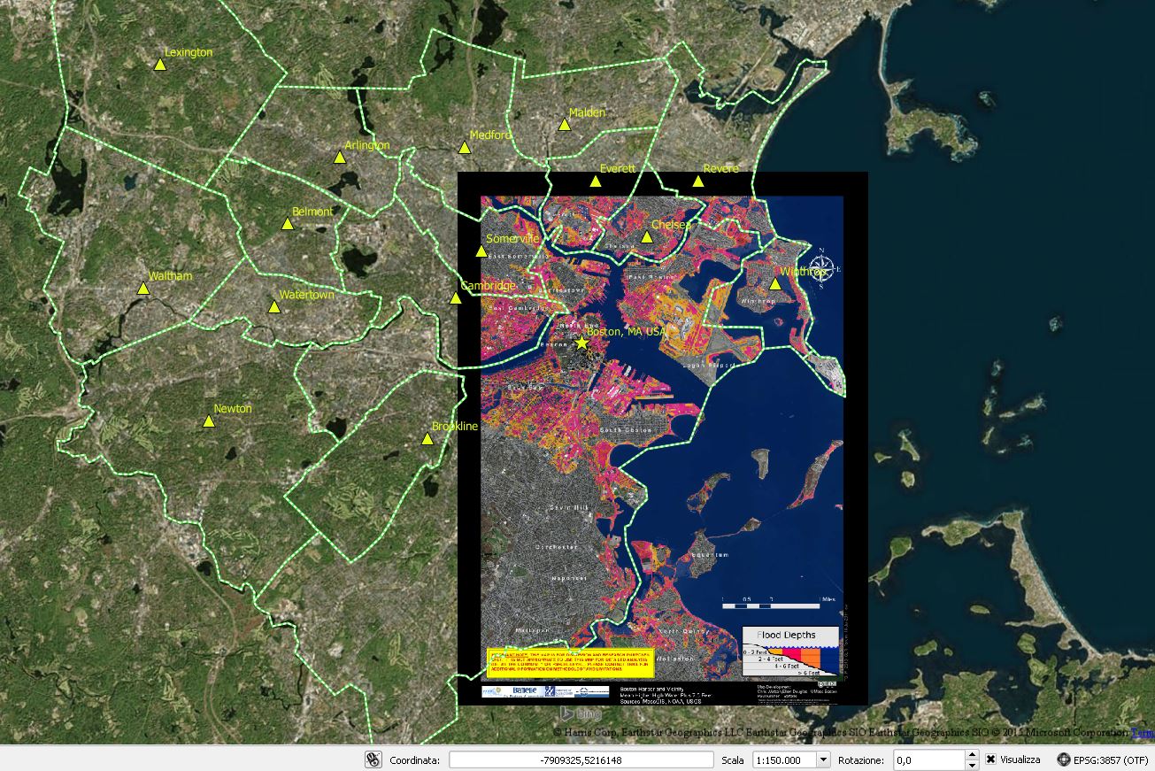
Flooding data: The Boston Harbor Association